
Most SEO reports are a graveyard of metrics that nobody reads. If your dashboard doesn’t force a stakeholder to make a decision or change a budget, it isn’t a report – it’s just noise.

I’ve spent years looking at raw Google Search Console (GSC) exports and GA4 properties for WooCommerce stores of all sizes. The biggest mistake I see is teams reporting a general increase in “traffic” without explaining where that traffic lands or if it actually converts into sales. In ecommerce, we don’t care about visibility in a vacuum; we care about moving SKUs. To do that, you have to transition away from raw tables and into opinionated, visual dashboards that segment your data by page type and commercial intent.
The problem with raw SEO data
Raw data is overwhelming and lacks the context necessary for strategic pivots. A 5-point ranking improvement sounds great in a spreadsheet, but as our WooCommerce SEO reporting guide points out, a ranking jump means nothing if your CTR stays flat. You might be moving from position 12 to position 7, but if the SERP is crowded with Sponsored Products and AI Overviews, your actual traffic might not budge.
When you present raw data to a client or stakeholder, you’re asking them to do the analysis for you. An opinionated dashboard does the opposite: it highlights the anomaly, explains the cause, and suggests the fix. Rather than showing a list of 1,000 keywords, a high-performing dashboard might show a scatter plot of keywords with high impressions but low CTR. This instantly identifies where your meta descriptions or titles are failing to capture the user’s attention. I have seen many instances where fixing a single title tag on a high-impression page generated more revenue than a month of link building.
Prioritize the metrics that actually move the needle
Not all metrics are created equal. If you are managing a WooCommerce store, you should stop obsessing over third-party “Keyword Difficulty” scores. We believe these metrics are often inaccurate because they rely on small databases that don’t represent the true scale of niche ecommerce opportunities. Instead, start focusing on your first-party data.
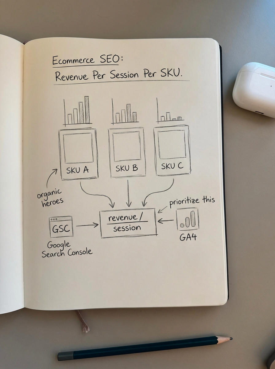
Revenue per session per SKU
This is the most overlooked and valuable metric in ecommerce SEO. It tells you exactly which products are your “organic heroes.” By combining Google Analytics and Search Console data, you can see which landing pages have the highest revenue-driving potential. If a specific SKU has a high revenue-per-session but sits on page two of Google, that is your immediate priority for content optimization.
Page type segmentation
You cannot report on an ecommerce site as a single entity. Category pages, product pages, and blog posts serve entirely different purposes and have different conversion expectations.
- Category pages are your biggest SEO opportunities. In my experience, optimizing category pages is far more important than individual product pages for long-term growth.
- Product pages should be tracked specifically for rich result eligibility. Missing or invalid schema reduces rich result eligibility by 32%, which directly lowers your click-through rate.
- Blog content is your top-of-funnel engine. While blog posts should convert higher than zero, their primary role is to build internal link equity back to your high-margin categories.
Visualization best practices for SEO reports
The goal of a dashboard is to make the performance obvious. If a stakeholder has to ask “Is this good?” the reporting has failed to provide context.
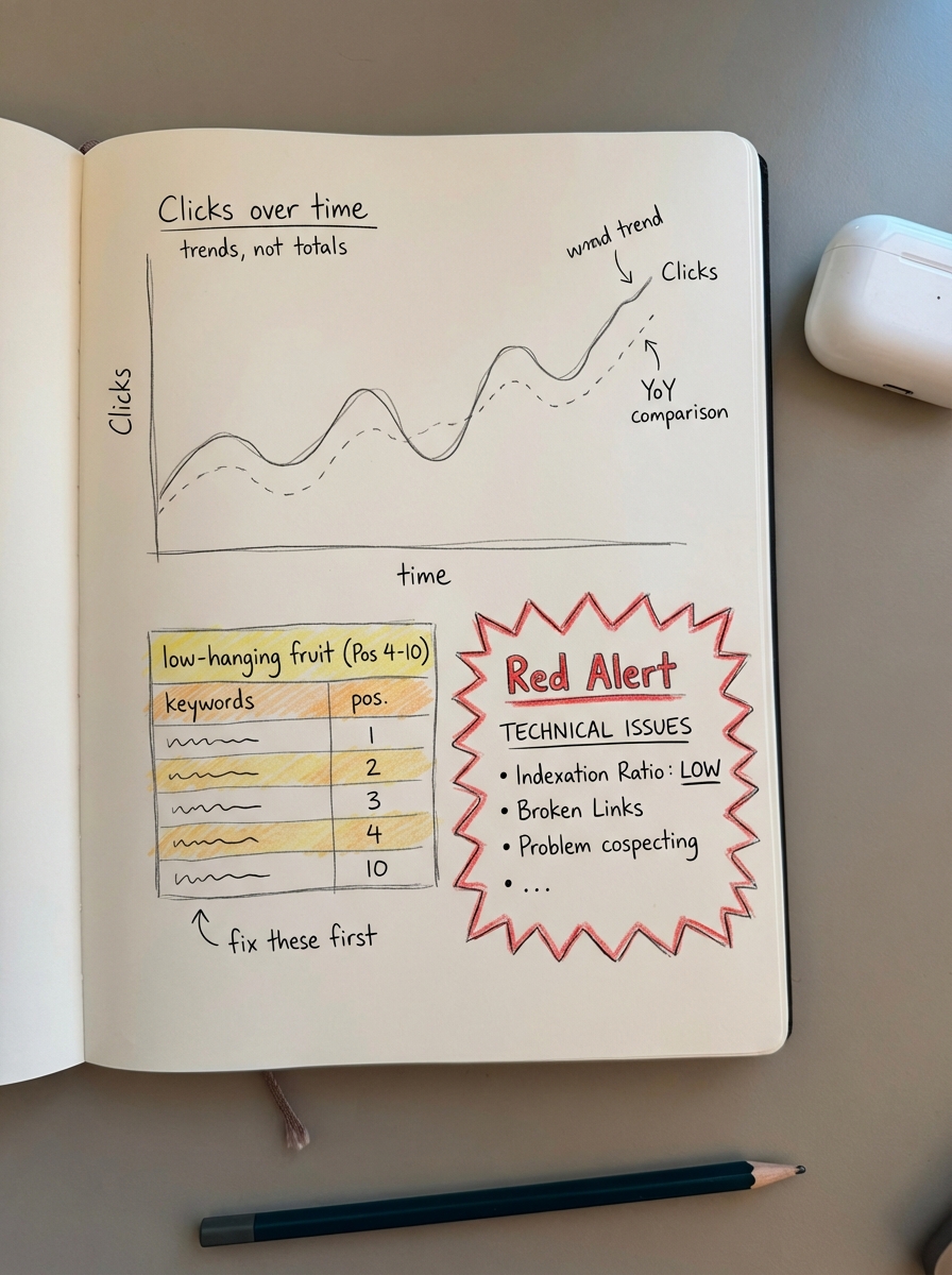
Use line charts for trends over totals
Don’t just show “Total Clicks” as a static number. Show clicks over time with a comparison to the previous period. For executive-level SEO reports, a year-over-year (YoY) comparison is essential to account for ecommerce seasonality, such as Black Friday surges or post-holiday slumps.
The low-hanging fruit table
I frequently use Google Looker Studio to build a table filtered specifically for keywords ranking in positions 4 through 10. These are terms where you are already on the first page but are missing the bulk of the traffic. Highlighting these in red or green based on weekly movement creates an instant “to-do” list for your content team to focus their optimization efforts.
Technical health alerts
Your dashboard should include a “Red Alert” section for technical SEO issues that could kill rankings overnight. I recommend monitoring the indexation ratio, which is the number of indexed pages versus submitted pages. If this ratio drops suddenly, it usually indicates a crawl bloat issue or duplicate content – the most common technical mistake we see in WooCommerce.
Building your reporting stack
You don’t need an expensive enterprise tool to build world-class reports. A combination of Google Search Console, GA4, and Looker Studio is often more accurate and flexible than third-party platforms.
- Google Search Console provides the raw visibility and ranking data straight from the source.
- GA4 allows for leveraging event tracking like “add to cart” and “purchase” by organic landing page, allowing you to link clicks to actual cash.
- ContentGecko automates the actual content production suggested by these reports. Our WordPress connector plugin allows us to sync with your SKU data and automatically produce the blog content that supports your high-priority categories.
By automating your SEO reports, you can stop spending 10 hours a week in spreadsheets and start spending that time on high-level strategy.
Turning insights into action
Once your dashboard surfaces a problem, the next step is iteration. If your dashboard shows that blog posts are getting traffic but not converting, you don’t delete them; you use conversion data to refine the internal links to related products.
If your data shows a specific category is underperforming despite having the right products, use a keyword clustering tool to see if you are missing sub-topic coverage. Often, you’ll find that competitors are ranking because they have addressed specific search intents that your category description currently ignores.
TL;DR
- Never mix blog, category, and product data in a single chart; always segment by page type.
- Focus on revenue-per-session per SKU via GA4 to find your organic winners.
- Use year-over-year comparisons to filter out seasonal noise and show true growth.
- Use the ContentGecko dashboard to turn data into a content strategy without manual exports.